
Mexican Restaurant:
“La Diabla” Branding.
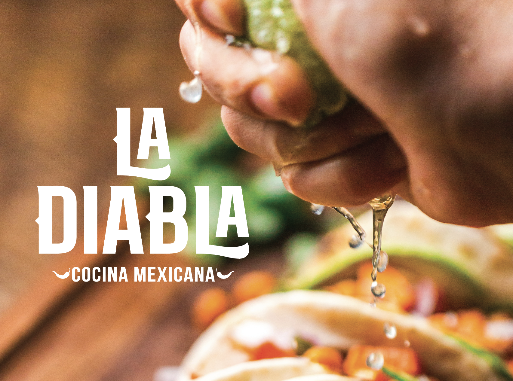
La Diabla is a Mexican restaurant concept conceived by me. Blending modern aesthetics with traditional Mexican charm, the goal was to establish a contemporary dining experience while preserving the essence of authentic Mexican cuisine.
The restaurant's name, “La Diabla”, meaning “The Devil”, represented visually, by peppers throughout the design.
During the initial phase of brand development, I created a comprehensive brand identity. This involved exploration of the company name and logo variations, as well as experimentation with form, color, and composition. This first step will always be the base for the whole design process.
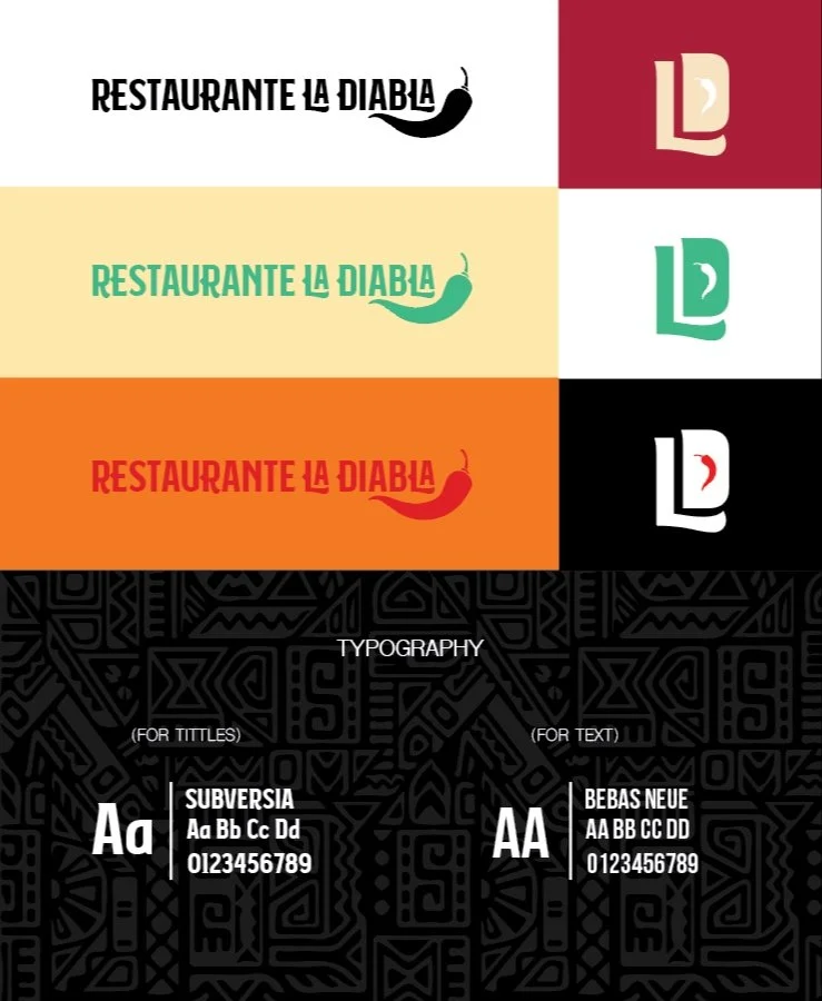

For the menu, I kept it simple mirroring the restaurant's aesthetic, sticking to just three colors: black, white, and red to match our logo's pepper. Strategically, letting the red from the pepper of the logo match the tittles of the dishes, to create visual cohesion.


